
Transcendental Meditation Hub

TM Hub is an application that supports a global community of Transcendental Meditation teachers to market and manage their courses. This is the story of how I designed and launched the application.
To comply with my non-disclosure agreement, I have omitted any confidential information from this case study.
In 2022, I joined Maharishi Foundation International (MFI) — a non-profit founded in 2020 to elevate the global community of Transcendental Meditation (TM) through digital transformation.
Since early adulthood, I had searched for meaning and happiness, often wondering if life was more than the endless cycle of desire and satisfaction. Meditation changed that. It helped me rediscover the peace that had always been there.
The opportunity to apply my design skills to a cause I believed in felt deeply meaningful. I was motivated not just to design a product, but to contribute back to a space that had given me so much.
A Wake Up Call to Transformation
Since the 1970s, TM spread rapidly across the world. What began as a movement rooted in India grew into a network of organisations, centres, and teachers. By the time I joined MFI, it spanned 108 countries, with more than 600 centres and over 40,000 certified teachers serving millions of practitioners.
This growth helped TM reach millions but also created fragmentation. Without central governance each country built its own processes, websites, and tools. Many relied on legacy systems decades old, struggling to meet modern expectations.
Meanwhile, the wellness industry grew more competitive, and COVID-19 pushed the demand for seamless digital experiences. Transformation became urgent.
MFI aimed to lead this change, Its boldest step was the TM app, launched in 2020, built to serve both practitioners and teachers with new ways to teach and learn.
The warning signs were clear: without radical transformation, the global TM network would struggle to stay relevant and risk falling behind.
The Challenge Empowering the Teacher Community
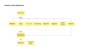
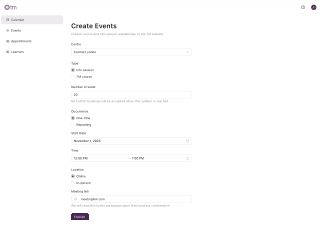
At the heart of this transformation was a new teacher dashboard, envisioned as the centrepiece of MFI’s digital ecosystem. The dashboard would serve as the gateway for teachers to unlock a suite of digital solutions, from a modern web presence to improved booking flows and app access — all aimed at drastically improving the practitioner experience.
By empowering teachers with better tools, we hoped to elevate the entire end-to-end journey for practitioners of TM. I was tasked with shaping the dashboard from its first sketch to its launch.
By empowering teachers with better tools, we hoped to elevate the entire end-to-end journey for practitioners of TM.
My Role
User Insight Generation
I led user research across the project, working with our researcher to uncover insights. I planned and ran interviews, task analysis, and usability tests.
Product Vision & Planning
I shaped the product vision by facilitating workshops with the team and stakeholders. I helped defined product objectives, value propositions, scope, and roadmap. This work built alignment when formal product leadership was missing, giving the team a clear direction.
UX Vision & Strategy
I created the aspirational UX vision and the strategy to reach it. I mapped the future user journey, set success metrics, prototyped early concepts, and defined guiding principles for design and development.
UI & Interaction Design
I designed the application end to end, from structure to components. I drove the adoption of a shared design system to align design and engineering, refined patterns to meet user needs, and worked side by side with engineers to ensure smooth delivery.
Rollout Support
I supported the rollout by coordinating across teams. I worked with the support team to create help content, with stakeholders to resolve blocking feedback, and with the PM to plan phased releases. In parallel, I partnered with the data team to design a tracking plan, ensuring we could measure adoption and track success.
First Hurdle Fostering a Shared Mission
The first challenge I faced was the lack of a shared mission. When I joined, the team was still forming, and MFI was shifting from a project-based to a product-based organisation. Formal product leadership was absent, and responsibility was spread thin across executives, product, design, and engineering. Each had their own priorities. With no clear objectives or approach, the team was paralysed.
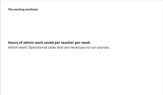
I saw this problem early and pushed for a bottom-up approach to create alignment. I found allies, including the new scrum master. Together, we ran workshops to gather input from the team and stakeholders. This work gave us a shared mission and brought clarity to the product’s North Star metrics, mission, and strategy.
We agreed to pilot the project in the US and UK — a decision that set the direction for our initial discovery.
User Insights A Shared Calling in a Diverse Community
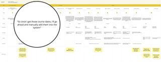
I worked with our user researcher to understand TM teachers — their motivations, needs, workflows, and pain points. We ran interviews and task analyses with nine teachers from different centres and contexts. These are the key insights:
More than a Paycheque
Beyond financial gain, teachers saw teaching TM as meaningful and fulfilling. Many were motivated by the joy of seeing students grow, the satisfaction of sharing something that had transformed their own lives, and the sense of belonging to a wider community.
A Side Gig or a Career
Teachers’ motivations varied with their level of commitment. Some treated it as a side gig, valuing balance and flexibility. Others saw it as a career, driven by ambition and a desire to extend their reach.
Workflow Differed with Teaching Load
Teaching volume shaped how teachers worked. In major cities, those with many students faced complex workflows, often relying on collaboration and division of labour. Lower-volume teachers managed with simpler, individual routines.
Wearing Many Hats
Teachers handled the full journey — marketing, sales, teaching, and follow-up support. In practice, they worked like small business owners, switching roles far beyond teaching alone.
When Tools Create More Work
Legacy systems often worked against them. Clunky, unreliable, and hard to use, many felt the tools served governance, not their needs. Some even hired assistants to manage scheduling and admin.
Innovation or Tradition
Teachers differed in their attitudes towards innovation. Some believed embracing technology was the way forward, while others prioritised preserving the authenticity of teaching with as much human touch as possible.
Tech Comfort Across Generations
The community spanned generations, and so did comfort with technology. Younger teachers and those in cities adapted quickly to digital tools. Older or less digitally native teachers preferred simpler workflows and direct interactions.
“I feel like these systems are designed by the people behind the scenes in a way that works for them. And then the teachers are told, you have to make this work for you.” – TM Teacher
Understanding the diverse realities of teachers gave us empathy for their needs — but to support them, we had to untangle the complexity they worked within.
Untangling the Complexity
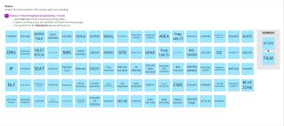
The deeper we looked into the organisation’s systems, the more tangled they became. Decades of growth had left a patchwork of tools, processes, and data models. In one database a “centre” meant a physical location; in another, it meant a legal entity. The same confusion applied to courses, organisations, students, and more.
These inconsistencies confused teachers and made it almost impossible to design a unified product. Everyone spoke a different language. Without a shared model, we risked adding another layer of complexity to an already convoluted system.
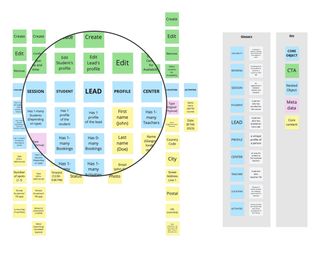
To break through, I ran workshops using the Object Oriented UX (OOUX) framework{:target="_blank"}, pioneered by designer Sophia Prater. OOUX focuses on modelling systems around the objects users interact with. Together, we unpacked the core objects of the teacher experience and redefined their relationships in ways that worked across contexts
The result was a simplified, shared model that not only clarified the system but also built trust between stakeholders, giving us a common foundation to design from.
Shaping the Vision From Complexity to Clarity
With user insights and a simplified model in place, we had a strong foundation to imagine what the product could become. The next step was to translate that clarity into a shared vision. I led the visioning process and collaborated with the team to define a set of value propositions that captured the application’s aspirational direction:
Unified Hub
The TM Hub brings everything together — from student management to course scheduling — so teachers no longer juggle multiple tools. A seamless experience keeps their focus where it belongs: their students.
Trusted Companion
We envisioned the TM Hub as a dependable partner in teachers’ daily work. Built on modern technology and designed with error prevention and recovery in mind, it would be a system teachers could trust.
Smarter Workflows
The TM Hub extends teachers’ reach through streamlined processes and thoughtful automation. Less time on admin. More time teaching and supporting students.
Business Transparency
The TM Hub gives teachers clear, actionable visibility into their work. Whether TM is a side gig or a full-time career, access to meaningful data helps them make confident decisions.
Shaped by Teachers
Legacy systems forced teachers to adapt to the tool and created extra work. Our vision was the opposite: an intuitive application that flexes to their needs and supports the way they work.
These values served as the northstar throughout the development including the product definition.
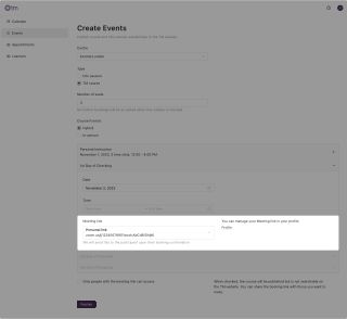
Defining the Core Functionalities
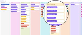
To turn vision into action, I created a user story map — a visual journey of the processes, activities, and features needed to support teachers’ workflows. I ran workshops with the team to define and prioritise the core functionalities for the first release.
By the time the vision was clear, the deadline was already looming. Our focus now turned to delivery — where a new set of challenges emerged.
Establishing the Design System
As we moved into delivery and detailed design, it became clear we needed a shared framework to keep design and development aligned. With tight timelines, building a custom design system from scratch wasn’t realistic. I led the search for one we could use out of the box.
My main criteria were:
- Robust components for data-heavy applications
- A shared language for designers and developers
- Built-in accessibility
- Clear, well-maintained documentation
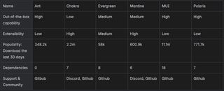
I explored several options and worked with engineers to evaluate them. Beyond features, we looked at the team’s past experience with each library to weigh adoption costs. In the end, we chose Ant Design. It offered a rich component set, strong design–development support, and familiarity within the team.
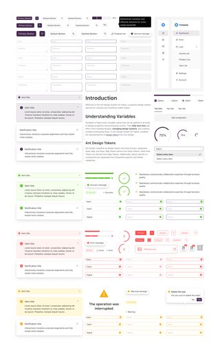
Adopting a design system gave us a shared toolkit and language — from tokens to components — that ensured consistency and accelerated delivery.
With a design system, design and engineering could finally play from the same sheet of music. But as we rehearsed together, we noticed that not every note resonated — some parts needed rewriting.
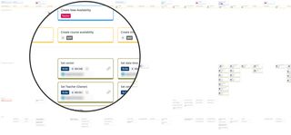
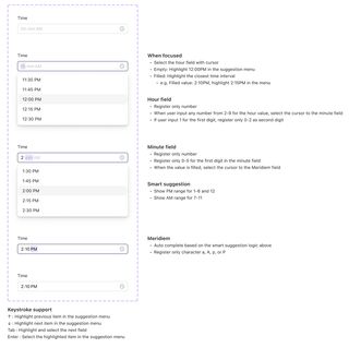
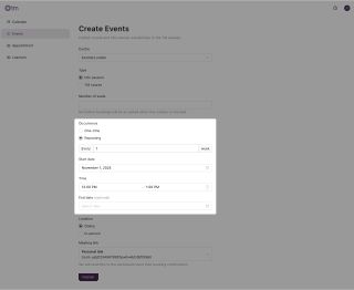
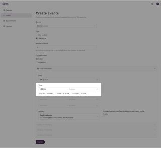
Picking on the Time Picker
Adopting a ready-made design system sped up development, but it also came with limits. One issue that stood out was the Time Picker. Teachers found the interaction clunky and counterintuitive. Entering times was one of the most common actions in the dashboard, so the friction quickly compounded. We had to fix it.

When I raised the issue, the front-end engineer agreed it couldn’t be ignored and was open to changing the component. But as we explored alternatives, we struggled to align on a better design.
From his perspective, the simplest fix was to remove the dropdown entirely, requiring teachers to rely on numeric input. It was straightforward to implement and easy to maintain. From my perspective, the solution needed to go further: the component had to be not just simple, but thoughtful in reducing friction. Since time input was a core action across the application, we needed to take a holistic view and design with the teacher’s broader context in mind.
What began as ideation turned into a heated debate. We both held strong opinions of what good UX should look like, and the back-and-forth stalled progress. Morale dipped, and the tension became exhausting.
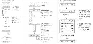
Realising that debating solutions wasn’t the way forward, I took a step back. I reached out to the engineer for an one-on-one conversation, probing into what he felt was important. I listened deeply, and in turn shared my own perspective beyond this component. The discussion revealed that our disagreement wasn’t about the what good UX looked like, but what good meant – The principles and value guiding our decisions. Once we surfaced those differences, we found common ground. From there, momentum returned. We aligned on a solution we could both stand behind – We felt excited to put it in teachers’ hands.
Defining What “Good” Means
The time picker incident revealed a deeper issue. Without shared principles, every disagreement risked turning into a battle of opinions. Differences in values surfaced as inconsistencies in the UX. We needed a compass to guide decisions.
Because of this, I created a set of design principles to guide decision making. These principles were grounded in user insights, lessons learned, and the development philosophy our team already embraced. Throughout the development, I used this to guide design decisions and communicate rationale with teams and stakeholders.
The result was a shift from opinion-driven debates to value-driven discussions, which accelerated decision-making but enabled a more consistent UX.
The Delivery From Abstract to Concrete
With frameworks in place, it was time to move from ideas to working software. The task was to turn concepts into workflows, refine interactions, and design at the screen level.
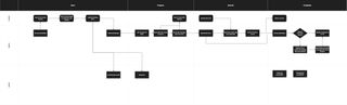
Process First
The first step was mapping workflows between teacher, student, and system. This gave the team a clear view of how features became actions and allowed us to streamline the teacher’s journey.
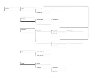
Organising Content
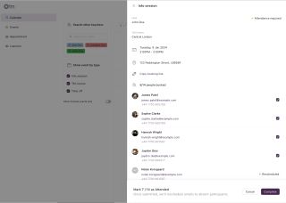
Building on the story map and object model, I organised the dashboard into clear, intuitive sections. I refined the taxonomy, hierarchy, and navigation, creating the information architecture that guided the whole product.
Detailed UI Design
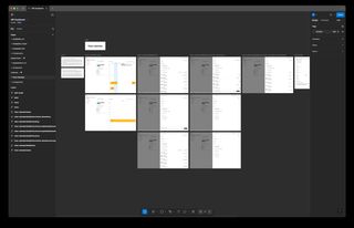
I designed the dashboard at both screen and micro-interaction levels. I worked side by side with engineers, polishing the UI and refining interactions. The process was iterative — design, build, test with teachers, repeat — until the dashboard felt smooth and intuitive in use.
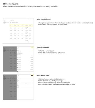
Help Content
To support the release, I partnered with the content team to create help materials teachers could rely on from day one. I led planning, mapping out every action in detail. Together we produced user guides and glossaries to aid adoption. With onboarding flows out of scope for the first release, these guides became the teachers’ first line of support and the backbone for User Acceptance Testing.
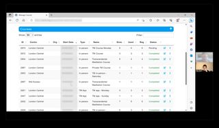
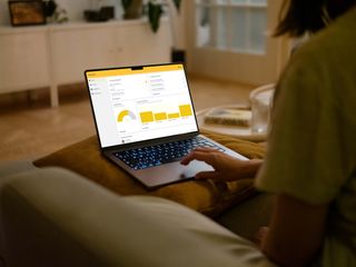
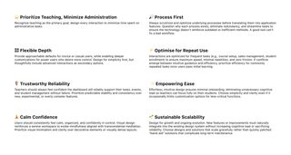
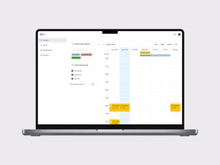
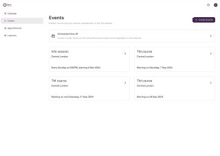
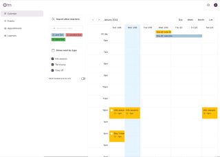
The Product TM Hub
Unified Hub
Teachers can manage all their TM activities in one place — from publishing courses on the TM website to planning schedules and managing students — without having to juggle multiple systems.
Less to Do, More to Teach
The TM Hub reduces unnecessary complexity, cutting data entry and actions by 70% compared to the legacy system. By removing redundant features, trimming governance overhead, and introducing automation, the experience becomes leaner, simpler, and more intuitive.
Automating the Heavy Lifting
Bulky, repetitive tasks are handled seamlessly by the Hub’s automation. These processes run quietly in the background, saving teachers time and effort while ensuring a consistent experience for students.
Effortless by Default
The Hub supports teachers with smart defaults and context-aware suggestions, reducing decision fatigue and minimising time spent on admin.
Collaboration Made Easy
Beyond individual workflows, the Hub empowers teachers to collaborate as a team. They can view each other’s schedules, hand off courses, and co-host events with ease.
The Impact
We launched the TM Hub in 2024 with a pilot group of TM centres in the UK. Early feedback showed that the new workflows saved teachers time and reduced the friction of repetitive admin. At the same time, the experience was held back by technical defects outside design’s control — a reminder of how critical reliability is to building trust.
Overall, teacher feedback was mixed but encouraging. They highlighted pain points and areas for improvement, but also validated the direction we had taken — confirming that a unified, teacher-centred application was the right path forward.
By the time I left MFI, the TM Hub had not yet been fully launched. Even so, the pilot provided proof of value and a clear roadmap for iteration, ensuring that future teams could continue to build on the foundation we had set.

Reflection Lessons Beyond the Pixels
The biggest challenge of this project was the constant tug-of-war between solving user problems and addressing internal ones. When I joined, there was no formal product leadership and the team was still in formation. Everyone had different perspectives on what we should prioritise, and the lack of alignment left us pulling in different directions.
I wanted to focus my energy on solving user problems, but I often found myself drawn back to internal challenges. These stemmed from misaligned interests, siloed communication, consensus-based decision-making, and the structural realities of a non-profit — where donor priorities can outweigh user needs. All of this created friction that shaped both the process and the product. In hindsight, I spent as much time building alignment inside the organisation as I did improving the experience for teachers.
That tension was frustrating, but also eye-opening. It reinforced the idea that product problems often mirror organisational problems, as suggested by Conway’s Law: If the organisation isn’t aligned, the product won’t be either.
This experience shifted how I think about my role as a designer. To improve outcomes for users, you sometimes have to start by improving the environment the product is created in. While I don’t have all the answers, this project revealed a new dimension of design’s role: beyond pixels and workflows, design can help navigate organisational complexity, bring clarity to uncertainty, and create the conditions for better products to emerge.