Spaceship Web App 2.0
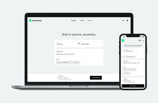
The Spaceship Web App is a product that simplifies cross-boarder shipping for the personal market. This is a case study of how I redesigned and launched the Web App's major update.
To comply with my non-disclosure agreement, I have omitted confidential information in this case study.
It was 2019, the world was taken by the storm of pandemic, we were learning everything again. From taking care of ourselves to connecting with others, we discovered new ways to make things work. Because of this, there were new demands to meet. One of which is the increasing need for cross-boarder shipping – sending stuffs from one country to another.
Traditionally, cross-boarder shipping felt like a chore. First, finding the right shipping service was difficult because the information you need to compare amongst services was hard to obtain. Most logistic providers (think FedEx, UPS, DHL) do not provide upfront fares or estimations for personal shipments.
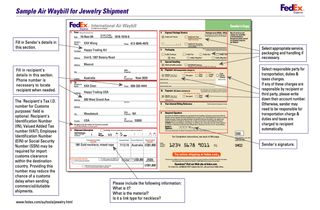
Next, getting an Air Way Bill (the label used to identified each parcel) for your shipment was tedious. It requires you to physically submit a multi-page form to logistic providers, declaring all the goods that you're looking to ship.
Finally, you had to figure out the packaging and transportations – Getting the parcel from your home to the hand of the logistic provider.
This was only the beginning of your shipping journey.
Spaceship introduced a simpler and smarter way to organise cross-boarder shipments to the personal market. Using the web app, customers could get a list of service rates based on the shipping routes. Once a shipment was booked, Spaceship would arranges the packaging and pickup for the shipment. It was like the Agoda for shipping.
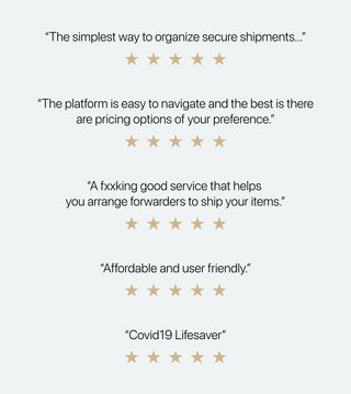
Launched in 2019, The MVP received great tractions from the get go, helping thousands of users to send and receive the things that they need across the world.
The Challenge Keep Up With the Rapid Growth
The original MVP struggled to grow alongside the rapid growth of the user base. First, the product needed to catch up to a new set of user needs and expectations beyond early adopters. Second, the MVP was built as an experiment rather than a sustainable product. As the user base grew, it struggled with usability, scalability and performance issues. Lastly, the lucrative market opportunity attracted new competitors to the space. The company was under a pressure to scale quick.
The challenge was to redesign and rebuild the product to match up the increasing demands and competitions.
My Role
I joined the team at the beginning of the product's growth phase. My responsibilities shifted as the product and team scale. These are the hats that I wore throughout the lifecycles:
User Insights & Research
I led the user research to uncover user insights throughout the development cycle. This included planning and conducting qualitative and quantitative studies to generate customer insights.
Product Vision & Strategy
I collaborated closely with the product manager to define the product vision and strategy. This included defining the product's roadmap and setting the right metrics. I led the definitions of product principles and evangelise them in and outside of the product team. This brought clarities for product decisions, and helped teams across the company to align on the path that we were taking to achieve our goals.
Experience & Interaction Design
I oversaw the redesign from 10,000ft to 1ft. At the architectural level, I worked with wider team to envision the overall experience and information architecture. At the component level, I worked alongside with 2 other designers to design the interactions, user interface, and detail visual specs.
Design Operations
I helped enabling a scalable and efficient design team. This included establishing predictable processes and work flows, setting up tools, infrastructures, and a design system that works across designers and engineers.
Early Insights The Usability Issues
At the outset of the project we didn’t have a clear mission or specific goals for the redesign. Without pre-existing insights, I tested the existing design with customers and conducted UX audit. My goal was to understand customers' frustrations and identify problems with the current design.
Decision Paralysis
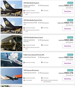
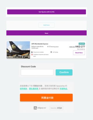
The existing design required customers to compare a long list of options to choose a shipping service. Customers needed to choose a service based on speed, price, item requirements and a slew of criteria. This could get even more difficult as services could share similar properties.
Unnecessarily Complex
The existing booking experience mirrors the process of filling out the physical form to logistic service provider, without much thoughts on shifting in context and medium. The result was a design that was filled with industry jargon and difficult to understand.
Tedious Form Filling
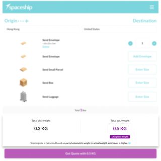
On average, customers had to spend more than 10 minutes to book a shipment on the existing Web App. Without any saved defaults, users had to provide informations that we already know every time when they book a shipment. This was not only tedious but also made the process to be error-prone.
Error Prone
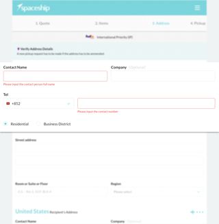
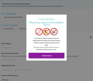
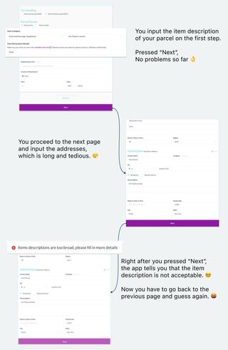
Service providers and customs frequently held or rejected customers' shipments because of incorrect information, and 80% of customers who booked for the first time would encounter errors during the process. The existing design offered little guidance to help users to prevent or recover from errors.
Unclear After-sales Journey
Booking a shipment via the Web App is only the beginning of the customer's journey. Certain shipments might require customer's actions along the way to proceed, but this was not presented clearly in the existing design. Customers would realised this only when their shipment was stuck for a prolonged period; Leading to frustrations and dissatisfaction with our product.
Inconsistency
Inconsistency was another issue with the previous design. This included inconsistent writings, visual elements, and interaction patterns. This was problematic for both the users and the team. For the users, this created confusions around using the product. For the team, this hindered our ability to scale and maintain the product.
Deeper Insights Why Do People Ship?
Prior to the redesign, the general assumptions was that customers were shipping with us to send gifts and supplies to overseas friends and family. However, our findings from exploration research suggested customers' motivations varied.
Knowing this, I collaborated with the PM to conducted further study on customers motivations. This included user survey, interviews and analytic studies. It was important to develop a deeper understanding about the various user goals early on.
These are the insights that informed our strategy for this version update and beyond :
Ship To Connect
Majority of customers ship to connect with friends and family in overseas. This was even more so during the pandemic, certain goods were in shortage because of supply chain disruptions. Sending gifts and necessities across the world became a way to people to support and connect with others. Because of the frequency of their shipments, the primary needs of this segment was affordability and convenience.
Ship To Get Things Done
Another segment we discovered was people who send physical items to complete certain tasks. For example, sending documents to institutes or return a product to a retail store. Because of time sensitivity of these shipments, the primary needs of this segment was speed, reliability and transparency of shipments.
Ship To Relocate
Shipping for relocation was another growing segment we discovered during the research. The political instability in Hong Kong caused a wave of people to relocate other countries. Because these shipments includes personal items that are meaningful and irreplaceable, the primary needs of this segment was safety and security of service.
Ship To Run Businesses
The last segment was customers who are shipping to run their businesses. This included order fulfillments and trading. These type of customers have drastically different needs and expectations from the Personal customers.
At the end, we've aligned with the management team that this version update would focus on the Personal market; The Merchant market would served with a different product if the market was proved lucrative.
Uncovering customers motivations early on enabled us to align on the product's target audience and develop a deeper understanding of their needs.
The Mission Work Backward From the Launch
Before I could jump into designing, it was important to define success and assess the current constrains.
At the start of the redesign, the existing product is causing much overhead to maintain. The operation and support teams was burning to handle large amount of problem cases that could be otherwise mitigated from the start. The product team was under extreme pressure to juggle between delivering duct tape solutions while moving forward with the version update.
Without a clear and transparent mission, the product team had to constantly justify for the prioritised backlog with the wider team. The result was demotivation, skepticism, and agony.
I've observed this pattern early on, and collaborated with the PM to define these realistic outcomes for this version update. We evangelised it with the wider team. This helped us to bring the much needed clarity and transparency for the update.
Establish a Launchpad for Meaningful Experiences
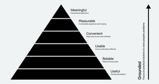
Our renewed understanding for customers' motivations reveals the opportunities to deliver more personalised and meaningful experiences for the customers. However, given the current constrains and state of the product, we've decided to first focus on delivering an easy-to-use, reliable and performant product, while enabling it for more innovations in later updates.
Smoothen the Booking Experience
Prior to the redesign, conversion rate was the only metric used to assess the health of the booking experience. I added the dimension of time, satisfaction and anxiety to measure the success of the booking experience. Our goal was to provide an intuitive and smooth booking experience for the customers.
Reduce Downstream Problem Cases
Many of the problems occurred during a shipment could be remediate or prevented during the booking journey. This included inaccurate item declaration, inappropriate service recommendations and unclear after-sales journey.
After we've defined the overall missions for the version update, I dissected the goals into metrics. This enabled us to implement the events tracking required for product health monitoring.

The Product Version 2.0: Less Information More Guidance
Whilst version 1.0 emphasised on giving information and control to customers, our vision for version 2.0 was to provide clarity and guidance throughout the shipping experience. We wanted to focus on helping customers to find the right service and organise their shipments with clarity.
Find The Right Shipping Service
Customers can use the web app to find service suggestions based on their needs, shipping routes, item requirements and histories.

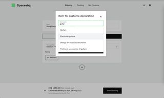
Suggestions for Customs Clearance
Customers can use suggestions to declare for smooth customs clearance. This is powered by the data of previous shipments which are cleared by customs successfully.
Easier Booking with Saved Info
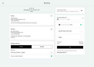
Customers who have previous shipments with us can use saved default and address book for easier and faster booking. This included shipping addresses, parcel sizes, payments and other preferences.
Keep Tabs on Every Steps
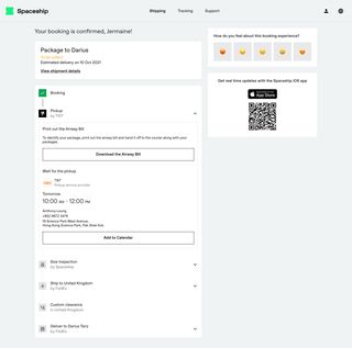
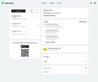
After booking a shipment, customers can see a clear overview of what will happen next. They can also receive notifications and view real-time updates on the Web App and iOS App.
How We Got There
I started the redesign by defining a set of brand and experience requirements. Since our expectations for the redesign was a complete overhaul. It was important to establish a shared vision on an abstract level. And because the redesign touched every part of the business, this also helped to provide transparency into our decision-making process with the wider teams.
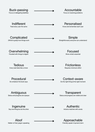
A technique I used to brainstorm was to reverse the polarity of an undesirable outcome. (I later learnt that this technique was advocated by Marty Neumeier in his book – Metaskills: Five Talents for the Robotic Age
I imagined the worst possible perception of Spaceship to be analogous to traditional logistic providers. Through this lens, I identified the unwanted traits and reversed them to articulate the (opposite) principles for the redesign.
Organise Tasks Based On Mental Spaces
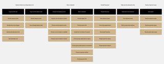
My earliest design challenge was to propose how we would structure the shipping experience. I organised the tasks based on distinct Mental Spaces. This technique was inspired by Indi Young from her book – Mental Models: Aligning Design Strategy with Human Behavior. Indi teaches us that structuring tasks around people's goals and the states of mind of an experience would often lead to a more intuitive product or service.
I've intentionally made this agnostic to the which touch-points or tools customers would use to carry out the tasks. This helped us to focus on the tasks first and then devise the best way to support them.
Generate Features to Support Tasks
Following the organised journey, I collaborated with members of the product team to ideate features to better support the users' tasks.
Through this exercise it became clear that we could deliver more value to customers with a wider support beyond the Web App. We envisioned a future where each shipment is supported by multiple products/services.
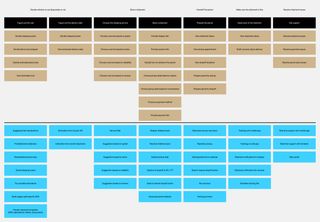
Although some of these features were not feasible at the time of launch, they were still important to help get the team excited about the future.
Service Suggestions
My next design challenge was to define how the service suggestions would work. I defined the search criteria by shipments requirements and user needs. My goal was to provide upfront rates and estimated delivery to the users with as little frictions as possible.
The key challenge for this feature was to figure out how we could filter the suitable services based on the item descriptions input by the user. With an enormous set of items, we needed a classification system to work upon.
I used the the Harmonized System to help classify the user described items. Since the Harmonized System (HS) was an industry standard, this enabled us to speak the same language with customs and logistic service providers. It also opened the door to use third party applications for HS code searching.
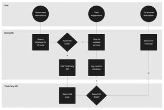
With this in place, I collaborated with our operational team to define which services are available based on the HS categories.
Item Suggestions with Empirical Data
Item declaration was the trickiest design challenge for this update. Spaceship supports shipping between 100+ countries, and each country has their own requirements for customs declarations. To complicate the problem, these requirements were often opaque.
Although the Harmonized System was an industry standard for declaring goods, the naming for each categories were far from accessible for most everyday people. We needed a set of suggestions that works for both customs and the users.
To solve this problem, I turned to the data we've collected since the MVP launched. I use our analytics tools to discover the items descriptions from all the past shipments. Next, I collaborated with the engineers to filtered for descriptions that had passed the check of customs.
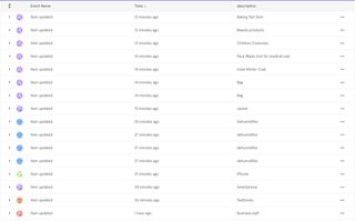
After some data cleansing and deduplications, we were able to form the basis for the search results. Although this whitelisting approach was not comprehensive and would require continuous updates, this enables us to help customers in find popular item descriptions for popular routes.
Instil Clarity Through Confirmations
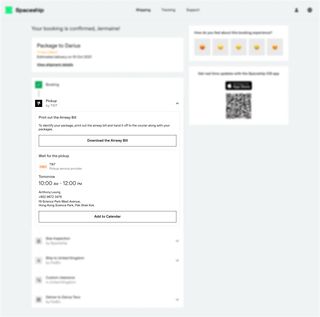
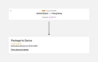
If the new experience was to prevent downstream shipment issues, the confirmation screen needed to instil clarity and show how the shipment's journey would unfold.
The key design challenge here was to consider what and how much information to show at this point of the journey. Three questions informed my design decisions for this screen :
- How do we show the shipment is being taken care of?
- How do we show just enough information to move the shipment forward?
- What are the key milestones that might requires customers's actions?

The Delivery Establish the Design System
Prior to the redesign, there was no reusable library for the team to design and build the product. As the product and the team scaled, we needed a more efficient way to work. I collaborated with the engineers to establish the foundation of a design system. This included :
- Reusable UI libraries for designers and engineers
- Usage guides and dev documentations
- A glossary for UI copies
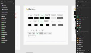
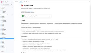
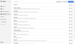
These libraries were used constantly by the team. Although it was quite time consuming set up. It saved us a lot of time later on and helped us to deliver a consistent experience to the app's users.
The Impact Positive Results with Much More Todos
The redesign of the Web App had a positive impact on the booking experience at the time of writing (2 months since launch). Conversions and customers satisfactions were significantly increased.
13% more Promoters compare to previous version
61% increase in conversion rate
While errors rate of the booking process decreased, the on-hold shipment rate has not been significantly decreased. This was largely due to the operational issues between Spaceship and the various service providers. I believe this to be improved as the operational flow improves and the collaboration matures.
